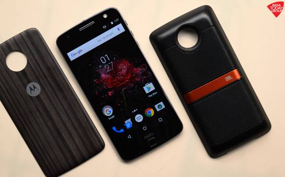

The Moto Z from Motorola, now owned by Lenovo, is a modular smartphone. It’s a modular smartphone done right. It’s something that LG tried and failed. The G5, although a fantastic smartphone, was modularly all over the place. It’s something that Google has been trying to achieve for quite a while now with Project Ara. But, that Ara take on the modular phone concept is yet to see a consumer release. All the three companies share the same vision: aspire for a future where one smartphone fits them all would mean the end of buying a new one every year.
It’s a fantastic concept, the kind you always read about in Sci-Fi, and yet here we are. The modular smartphone is not a distant dream any more. It’s out there and looking at the Moto Z, well, the future sure looks glorious indeed.
The Moto Z is the spiritual successor to the original Moto X (more precisely, the Moto X Style) of last year. Lenovo might have killed the iconic Moto X, but there’s a method to its madness. These are desperate times, and desperate times call for desperate measures. The Moto X was in dire need of evolution more than ever now. Better now than later.
Also Read: Forget smartphones, the future belongs to modular phones
The Moto Z is therefore a different smartphone. Different from anything Lenovo has ever built. It’s a new-age Moto phone replete with top of the line hardware and top of the line premium looks. It’s dreamy and yet so real. Amid the Galaxies and the iPhones and the Pixels, the Moto Z is without a doubt the most underrated phone of 2016.
Design and build quality
The Moto Z is undeniably the most premium Moto phone ever. It’s an all-metal phone with 16 magnetic connector pins on the rear. The phone supports several modules that Lenovo calls Moto Mods which snap on to its back via these connector pins… without a tussle. The LG G5, in comparison, is downright intimidating in this regard. The entire lower strip of metal in the G5 pops out with the help of a small button. But it’s not that simple. The button sits rather flush which means it wants your unflinching attention always and pulling out the module takes some time and effort. Popping it out and swapping it with a different module seemed way cooler on paper. Not so much in reality though.
Also Read: Lenovo launches Moto Z Play & Moto Z in India, price starts at Rs 24,999
The Moto Z on the other hand looks cool — as a modular phone — and snapping those modules on to it seems even cooler. The phone doesn’t end up looking like a laboratory experiment gone wrong. Google’s Project Ara phone may have more modular options — which is good — but the whole thing still looks, for the lack of a better word, like a sophisticated toy. The biggest positive of Moto’s approach, over LG’s is that you don’t have to turn off the Moto Z every time you feel the need to swap a new module. The G5 must be turned off every time you do that.
Folks who made this phone knew from the very beginning what they were getting into. The Moto Z was supposed to be a phone and a modular one at that. The way the company was shaping it meant the phone would take a beating had it been as thick and chunky as previous Moto Xs. The Moto Z is razor thin — 5.2mm to be precise – to the extent that it’s ridiculous.
Moto phones have always been huge and chunky blocks of plastic. They’ve been curvy, in a very Moto-esque kind of way. They’ve had this very characteristic dimple on the rear, which one would imagine could house a fingerprint scanner one day. The Moto Z, on the other hand, is flatter than a pancake and sharper than a Sony Xperia. It also has a very prominent camera bulge on the back that sticks out like a sore thumb. If that wasn’t enough, the 16 magnetic connector pins on the rear look odd to the extent of looking ugly. This is a phone that literally shouts out to be shell-shocked always. Thankfully, Lenovo has a whole stack of swappable skin modules that you can buy separately and it includes one in the box. After all, a Moto Z without a style shell cover back plate is hard to imagine. It does come off quite easily when you accidentally drop it though, so you better be careful.
The Moto Z looks cool — as a modular phone — and snapping those modules on to it seems even cooler. The phone doesn’t end up looking like a laboratory experiment gone wrong
The front, meanwhile, is very reminiscent of the Moto G4 Plus. The bezels have been well executed and screen-to-body ratio is also good. The phone comes with on-screen navigation keys and a fingerprint scanner below. The existence (and the positioning) of the odd square-shaped fingerprint scanner is questionable, much like it was in the Moto G4 Plus, but at least Lenovo can argue “where else would we place it, you know?” All of that is fine, but I still don’t buy the idea of having soft keys and a fingerprint reader below that does nothing else but lock and unlock the phone. Maybe a Samsung approach (have a home button that doubles as fingerprint sensor flanked by capacitive keys) would have been better. There have been countless times when I hit the fingerprint reader expecting that it would take me home. But alas, it did not, because obviously!
The Moto Z also does not have a 3.5mm audio jack and ships with a dongle in the box to connect your regular 3.5mm headphones.
[source;Intoday]


