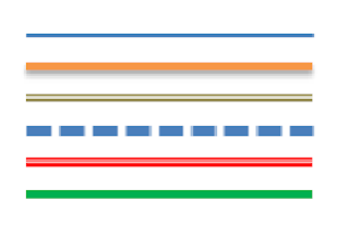
This article shows how to put a horizontal separator line between posts in your blog, using either HTML’s line command, or CSS rules. It also has suggestions about ways of formatting these lines using different colours and line-styles.
There are at least four approaches to choose from if you want to put a divider between your posts in Blogger. These days, I prefer the CSS-rule approach, because it’s so easy and flexible. But I’ve shown details of a few other methods too:
- Manually add a horizontal line command to each post
- Use the post-footer colour block as a line (in Designer templates only)
- Add the HTML command for a line to the main section of your template, in one of the post-footers
- Add a top or bottom-border to the CSS rule that formats the body of your posts.
The following sections give more detail about each option, including how to apply them to your blog, and their advantages and disadvantages.
Contents
Manually add a line to each post
When you are editing a post, you can put a horizontal line anywhere in the contents.
In the post-editor:
- If Post options > Compose Settings is set to Interpret typed HTML, then you can just type <hr />, and Blogger will place a line like this in your post.
- If Post options > Compose Settings is set to Show HTML literally, then you need to switch to the HTML tab before you type <hr />.
Disadvantage: If your post is set to display comments, or the blog is set to show the author, labels etc under the post, these items will be underneath any line that you add manually to a post.
If your blog has a designer theme (ref, What sort of theme have I got), then the Theme Designer > Advanced tab may have an option for setting the background colour of the post-footer (depending on which theme you are using).
If you use a dark colour (or have a dark background and use a light color), this makes the post-footer look like a line.
Disadvantage: The “line” might be a bit thicker than you like. And if your post is set to display comments, or the blog is set to show the author, labels etc under the post, these items are shown right inside the footer line.
Add a line-command to your theme
If you don’t like the other two approaches, you can change your theme to add a horizontal line. To do this:
Edit your blog’s theme in the usual way.
Most themes have three footer lines: what is in each one depends on the theme, and how you have arranged the items in the Layout > Blog Posts editor. Look at the theme for code like this:
<div class=’post-footer-line post-footer-line-2‘><span class=’post-labels’>
<b:if cond=’data:post.labels’>
<data:postLabelsLabel/>
<b:loop values=’data:post.labels’ var=’label’>
<a expr:href=’data:label.url’ rel=’tag’><data:label.name/></a><b:if cond=’data:label.isLast != "true"’>,</b:if>
</b:loop>
</b:if>
</span> </div>
OR
<div class=’post-footer-line post-footer-line-3‘/>
</div>
Add the <hr /> command to which ever of the footer-lines you want it in, for example
<div class=’post-footer-line post-footer-line-3’/>
<hr />
</div>
Advantage: you can easily place the divider line anywhere you want it, relative to the other items in your post-footer.
Disadvantage: you need to modify your theme, and this does have some risks. And it does use the <hr /> tag which some people (CSS purists) suggest is not a good idea.
Enhancements to the basic <hr /> command
There are lots of ways you can modify the <hr / > code. For example
<hr style=”text-align: left;” /> – to left-align it
<hr style=”color: red;” /> – to change the colour
<hr style=”width: 50%;” /> – to make it narrower
See w3c.schools <hr /> tag for more information.
Add a border to the CSS rule that formats your posts
The cascading-style-sheet rules in your theme control most aspects of how your blog looks. They can be a very powerful way to control how your blog looks – and give a quick way to add a line between your posts.
What to do
If you have a designer template, then the quick way to make this change is to add a CSS rule to your theme. The rule code to add is:
.post-body
{
border-bottom:1px dotted #666666;
}
or this one if you want the border at the top of each post:
.post-body
{
border-top:1px dotted #666666;
}
Making more complex changes
The CSS rule that controls how the “body” of your posts look is .post-body. To make changes to it:
1 Edit your theme in the usual way.
3 Look for .post-body in the rules section . It will look something like this, but the exact lines and values may be different:
.post-body {
margin-top: 0;
margin-$endSide: 2px;
margin-bottom: 0;
margin-$startSide: 3px;
}
4 If you can find a .post-body rule, then add this line, just before the } character.
border-bottom:1px dotted #666666;
5 If you cannot find a .post-body statement in the rules section of your template, then you need to add it.
Put it somewhere:
After <b:skin><![CDATA[/*
Before ]]></b:skin>
But not in the middle of any other rules: look at how the rest of that section of your template is laid out for clues.
The statement to add is something like the following, though you may want to try out different values for parts of it.:
.post-body {
border-bottom:1px dotted #666666;
margin-top: 0;
margin-$endSide: 2px;
margin-bottom: 0;
margin-$startSide: 3px;
padding-top:10px;
margin-top:20px;
}
Alternative formats
The #666666 means draw the line in black – you may like to use a different colour, or use the word “solid” instead of “dotted” to make a firmer looking line.
[“source=blogger-hints-and-tips”]


